Bella Vista
I redesigned the mobile version of the Bella Vista restaurant website to create a cleaner, more accessible and user friendly experience.

Project overview
I redesigned the mobile version of the Bella Vista restaurant website to create a cleaner, more accessible and user friendly experience.
The existing Bella Vista website had several usability, consistency and accessibility issues. The goal was to redesign the mobile website into a cleaner, clearer and more accessible experience.
My role
Solo project: I did the UX research, the low and high fidelity prototypes in Figma, the visual design and the accessibility improvements.
Research
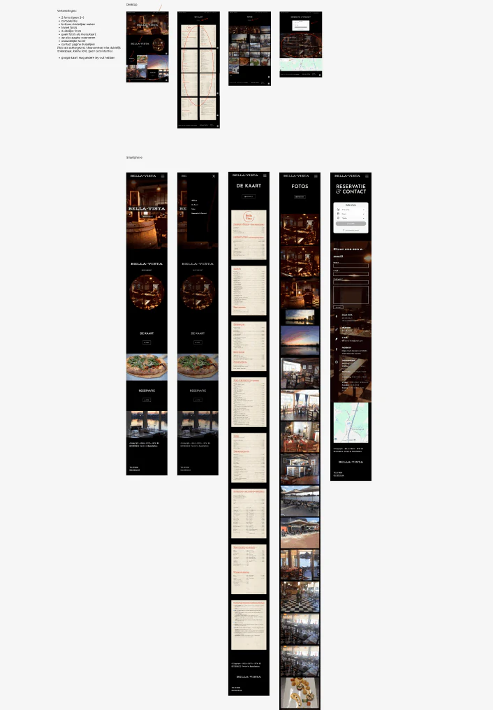
I started by analysing the current Bella Vista website on desktop and smartphone. These were the main improvements I identified:
- use only 2 fonts instead of 3 or more
- more consistency throughout the website and between pages
- clearer buttons
- fewer photos
- clearer, more readable fonts, and none that are too small
- no photos as menus or cards when they make information unclear
- the reservation option available on every page
- a clearer footer
- a clearer contact page
- more readable text on top of background photos
- better colour contrast
- a clearer layout for the Google Maps section
UX process
I started with UX research and a low fidelity prototype, then developed the high fidelity design in Figma.
I focused on reducing visual clutter by using fewer fonts and fewer overwhelming images, which made the interface more consistent and readable. Accessibility was part of the design process from the start, not something added at the very end.
Low fidelity designs
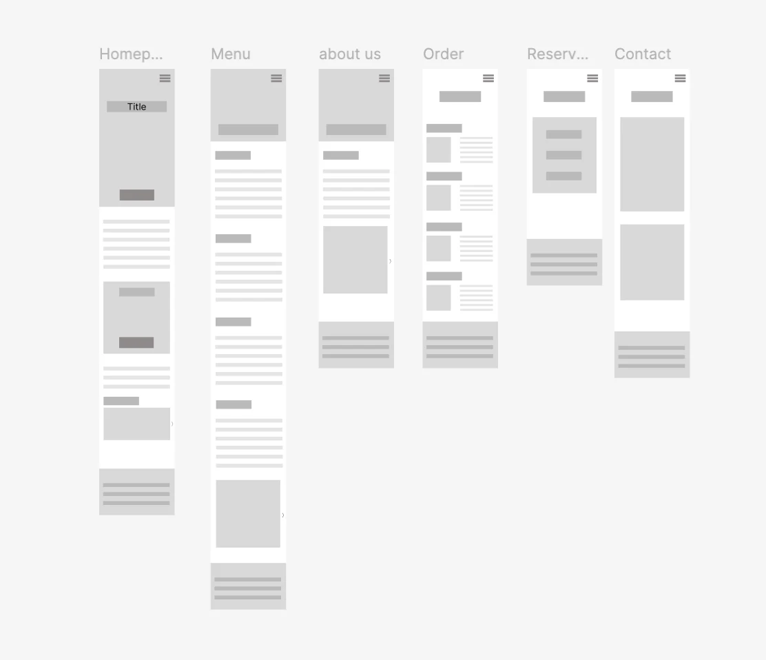
The wireframes set up a simple structure for the most important pages: home, menu, about us, ordering, reservations and contact.
High fidelity designs
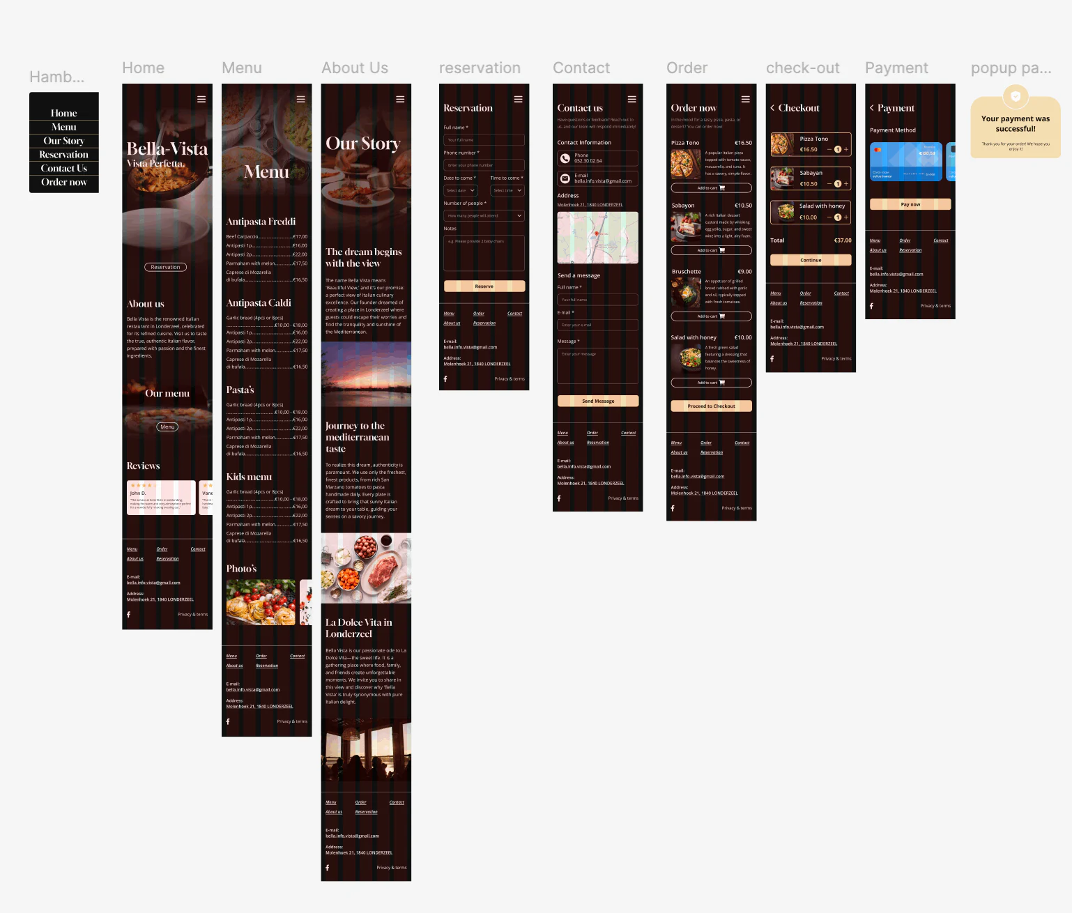
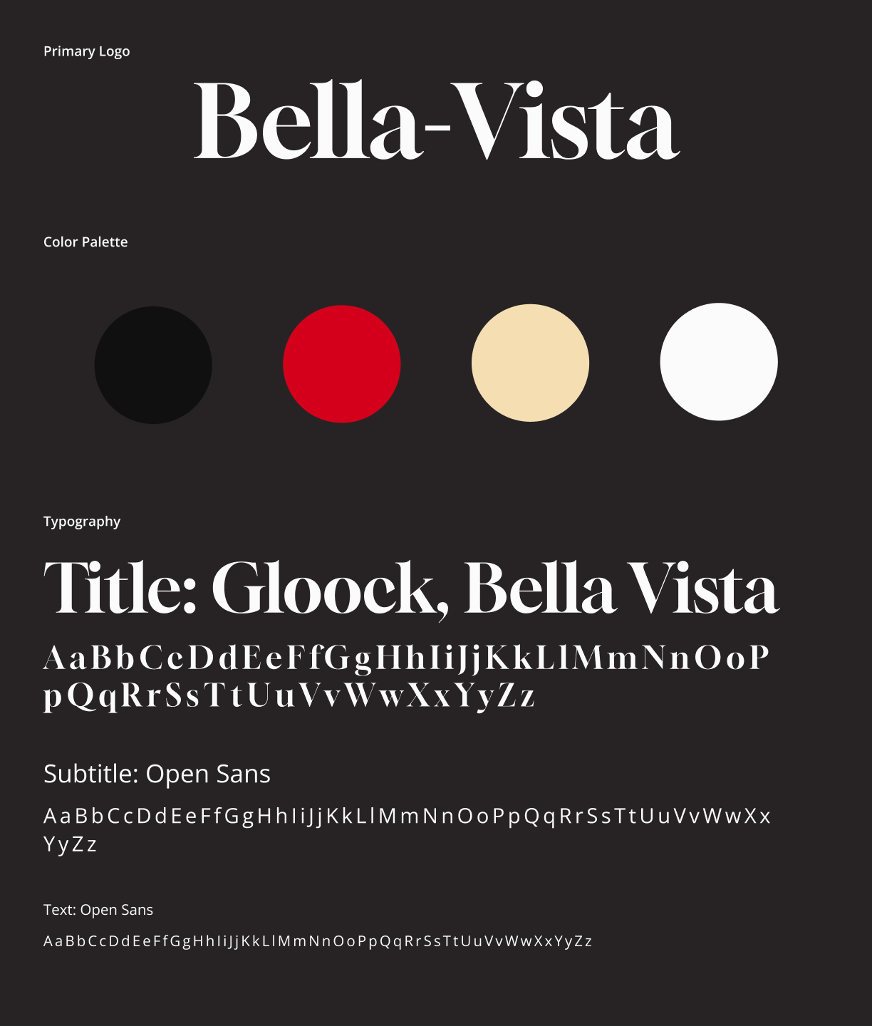
For the high fidelity design I created a warm, recognisable style: Gloock for titles, Open Sans for text, and a palette of black, red, cream and white.
Accessibility
I improved several accessibility aspects in the redesign:
- larger font sizes where necessary
- better colour contrast
- less dominant images
- text that is easier to read
- clearly marked required form fields, so users know what to fill in
- clearer interactive elements
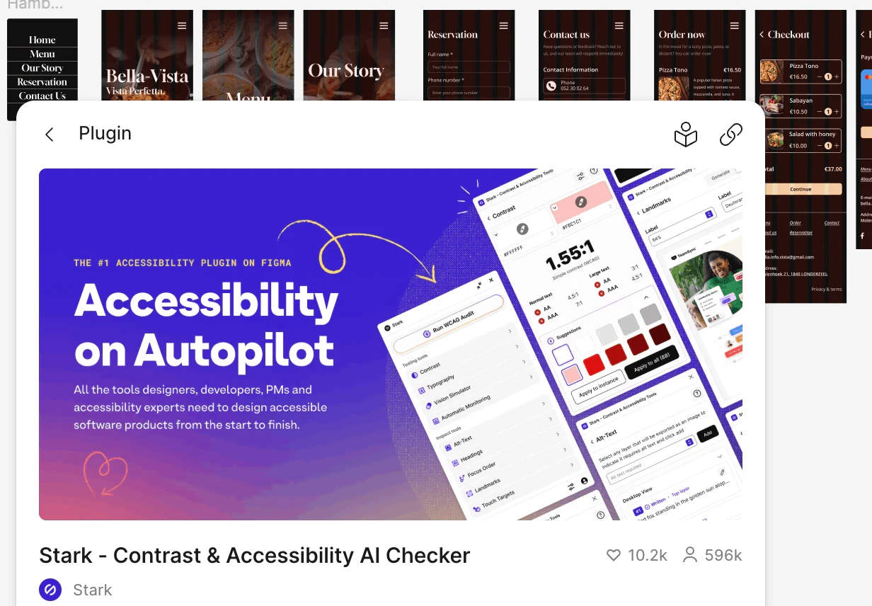
After making these changes, I checked the design with the Stark accessibility plugin in Figma to verify that it passed the relevant accessibility checks.
Final result
The result is a cleaner mobile website that is easier to use for every visitor.
Reflection
This project taught me how much small design decisions affect accessibility and usability. I became much more aware of font size, contrast, form labels and visual clutter when designing an interface.
If I did the project again, I would do more user testing with the redesigned version to validate my decisions with real users.
let’s create
together.
I’m looking for an internship from February to May 2027 where I can learn, contribute and grow. Have a project or a spot on your team? I’d love to hear from you.