AED Studios
Together with my group, I designed and built a web app for AED Studios, a company that rents out studios and other facilities. Our final concept was selected by AED Studios as the winning version.
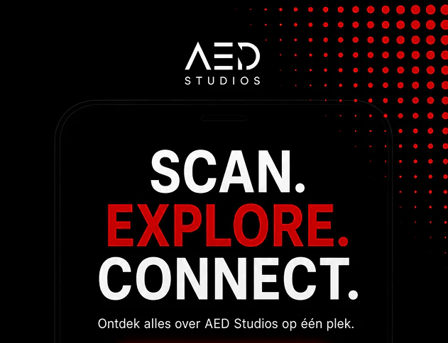
Project overview
Together with my group, I designed and built a web app for AED Studios, a company that rents out studios and other facilities. Our final concept was selected by AED Studios as the winning version.
The goal was to create a web app for AED Studios that gives visitors a clear and user friendly way to explore their studios and information.
My role
Most of the project was done together as a group. I specifically worked on the Studios page and was responsible for coding everything related to that page.
Research
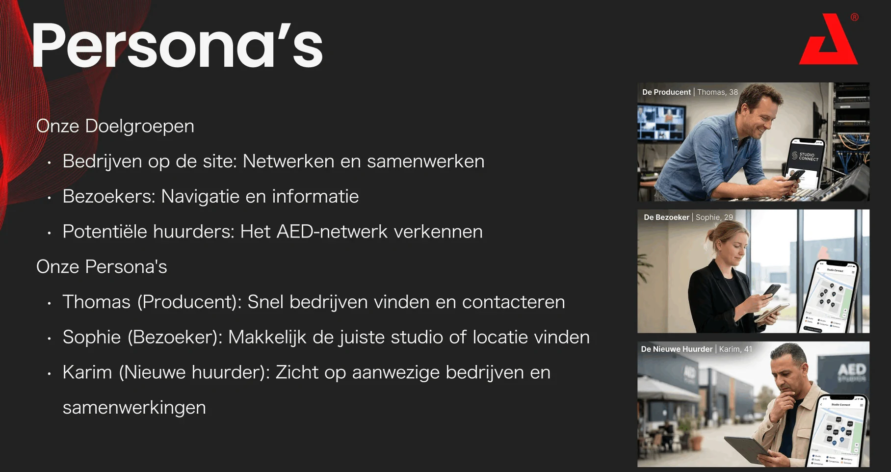
We visited AED Studios in person to learn more about the company and its services, then continued our research online. We defined three target groups (companies on the site, visitors and potential new tenants) and turned them into three personas:
- Thomas, the producer: wants to find and contact companies quickly
- Sophie, the visitor: wants to find the right studio or location easily
- Karim, the new tenant: wants to see which companies are there and how they work together
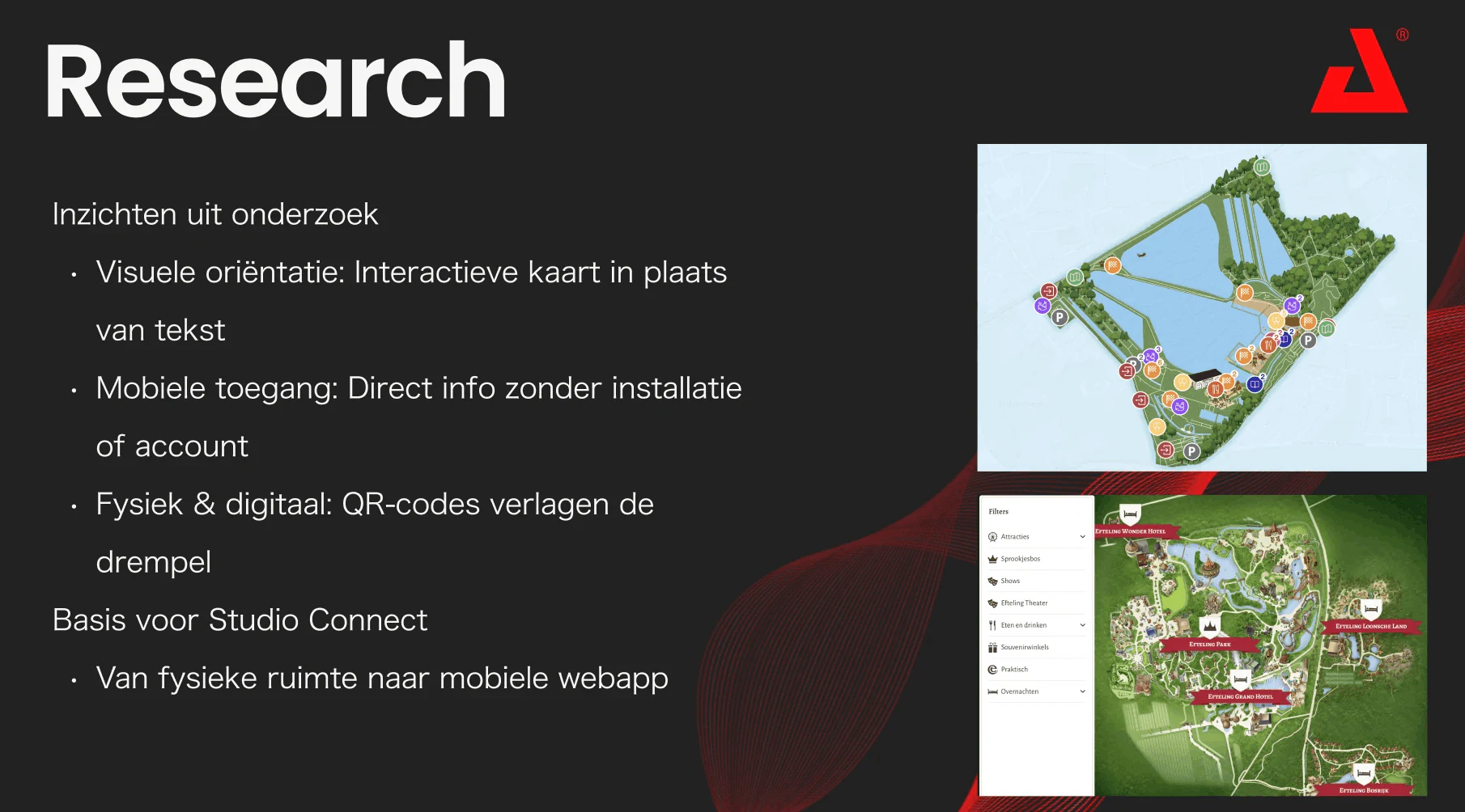
Our research gave us three key insights: an interactive map works better than text for finding your way, visitors want information instantly without installing an app or making an account, and QR codes on site make it easy to go from the physical space to the web app. This became the basis for Studio Connect.
Later, we tested our design with 5 people (3 students and 2 external users) in three scenarios: navigating the map, finding productions and registering for an event.
UX process
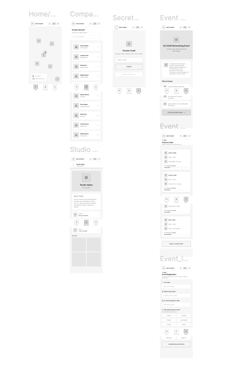
We started with research, turned our insights into a low fidelity prototype and refined it into a high fidelity design before building the web app.
For my part, I focused on making the Studios section clear and easy to navigate, so users could quickly understand the available information. I also made sure my pages stayed visually consistent with the rest of the web app the group created.
Low fidelity designs
The wireframes map out the main flows: an interactive map of the studios, the studio network, a secret access code and signing up for a networking event.
High fidelity designs
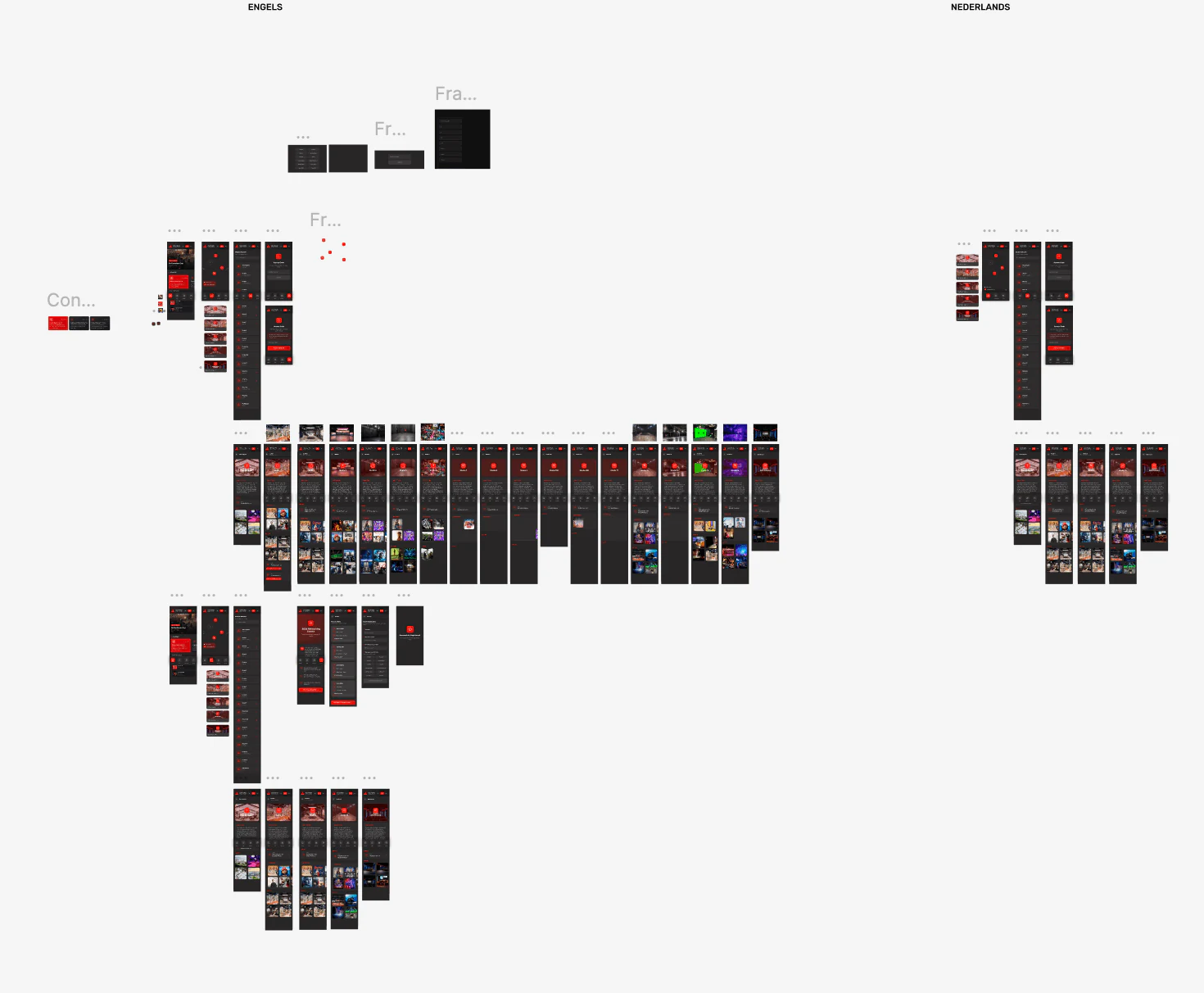
In the high fidelity design, the app got the bold red and black look of AED Studios, with every screen designed in English and Dutch.
Development
We developed the web app with HTML, CSS and JavaScript in VS Code, and used GitHub for version control so the whole group could work on the code together. I personally coded:
overview.htmlinformation.html- the CSS for these pages
This gave me more practical experience with HTML and CSS, and taught me how to translate a design into a working web interface.
Final result
Our final concept was selected by AED Studios as the winning version. The web app is live, so try it yourself or watch the demo.
Reflection
This project taught me how to collaborate on a larger web project while still taking responsibility for specific parts of the final product. I also gained more confidence in translating Figma designs into working HTML and CSS.
If I did the project again, I would spend even more time testing my own pages with users and improving them based on their feedback.
let’s create
together.
I’m looking for an internship from February to May 2027 where I can learn, contribute and grow. Have a project or a spot on your team? I’d love to hear from you.